TEALEAVES Recreates PANTONE's Color of the Year 2020 with a Blue Tea

THE MAKING OF THE OFFICIAL BESPOKE TEA BLEND

Color of the Year 2020

PANTONE 19-4052 CLASSIC BLUE  

A reassuring presence instilling calm, confidence and connection.


THE OFFICIAL BESPOKE TEA BLEND

Pantone Color of the Year 2020

HERBAL BLEND

Skies of blue. Oceans of life. Palates of purpose. A new era dawns at dusk.

Pantone Color of the Year 2020 blend invites the new decade with notes of tranquility, dependability, and elegance.

AROMA: Sweet fruit perfume, memorable citrus
PALATE: Tranquil mélange of peaceful berry notes
PURPOSE: Expand horizons  


Inspired by the rich symbolism associated with PANTONE 19-4052 Classic Blue, TEALEAVES’ Master Blenders have used the highest grade botanicals to blend Pantone Color of the Year, a wellness-oriented herbal berry mélange and the epitome of a perfect palate expression.

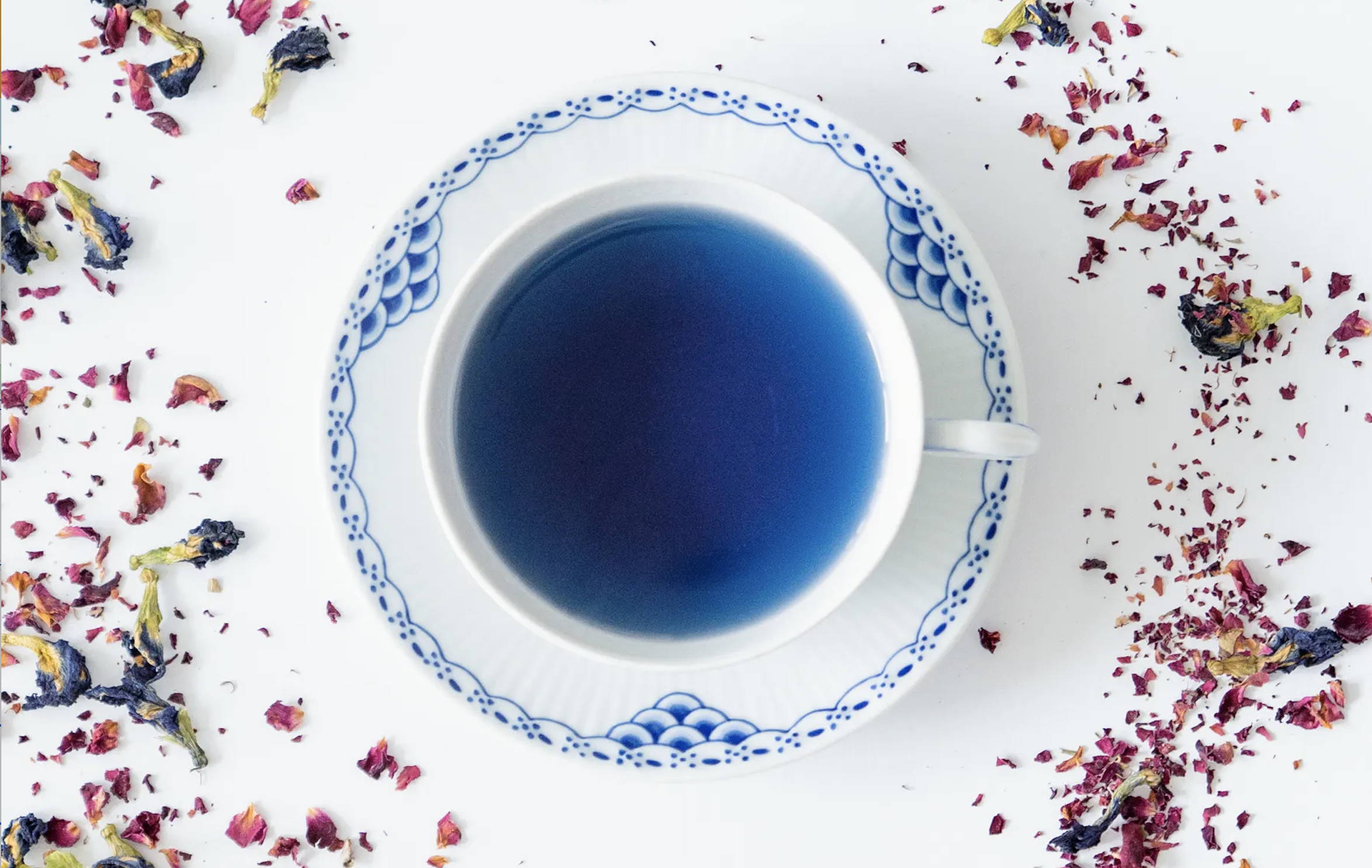
Masterfully blended to steep a brilliant blue hue, this blend showcases the timeless sophistication of PANTONE 19-4052 Classic Blue. Evocative of the sky at dusk, Pantone Color of the Year 2020 blend is a reliable and poised cup, which can be enjoyed hot, iced, as a stunning blue latte, infused in a tea cocktail, or zero-proof beverage.

With the addition of citrus, watch as the Classic Blue tone transforms into a brilliant violet hue, evocative of the shades of the night sky at dusk.

"Inspired by the elegant simplicity of this blue hue, we created a tranquil herbal blend which speaks to well-being and connection. The tea blend that we have created is the epitome of a palate expression of the Classic Blue; a boundless, dependable and optimistic blend. After countless hours spent blending, we are tremendously pleased with the result."

LANA SUTHERLAND
TEALEAVES CO-FOUNDER & CEO

ABOUT PANTONE 19-4052

Classic Blue

A reassuring presence instilling calm, confidence and connection. A timeless and enduring blue hue elegant in its simplicity. Suggestive of the sky at dusk, the reassuring qualities of the thought-provoking PANTONE 19-4052 Classic Blue highlights our desire for a dependable and stable foundation from which to build as we cross the threshold into a new era.

Imprinted in our psyches as a restful color, PANTONE 19-4052 Classic Blue brings a sense of peace and tranquility to the human spirit, offering refuge. Aiding concentration and bringing laser-like clarity, PANTONE 19-4052 Classic Blue re-centers our thoughts. A reflective blue tone, Classic Blue fosters resilience.

As technology continues to race ahead of the human ability to process it all, it is easy to understand why we gravitate to colors that are honest and offer the promise of protection. Non-aggressive and easily relatable, the trusted PANTONE 19-4052 Classic Blue lends itself to relaxed interaction. Associated with the return of another day, this universal favorite is comfortably embraced.  


ABOUT

Pantone Color of the Year

For 21 years, Pantone's Color of the Year has influenced product development and purchasing decisions in multiple industries, including fashion, home furnishings, and industrial design, as well as product, packaging, and graphic design.

The Color of the Year selection process requires thoughtful consideration and trend analysis. To arrive at the selection each year, Pantone’s color experts at the Pantone Color Institute™ comb the world looking for new color influences. This can include the entertainment industry and films in production, traveling art collections and new artists, fashion, all areas of design, popular travel destinations, as well as new lifestyles, playstyles, and socio-economic conditions. Influences may also stem from new technologies, materials, textures, and effects that impact color, relevant social media platforms and even upcoming sporting events that capture worldwide attention.

"We are living in a time that requires trust and faith. It is this kind of constancy and confidence that is expressed by PANTONE 19-4052 Classic Blue, a solid and dependable blue hue we can always rely on... A boundless blue evocative of the vast and infinite evening sky, Classic Blue encourages us to look beyond the obvious to expand our thinking."

LEATRICE EISEMAN
EXECUTIVE DIRECTOR, PANTONE COLOR INSTITUTE™

THE COLLABORATION


PANTONE® x TEALEAVES

Partners with PANTONE® in curating colorful experiences since 2015, TEALEAVES, the luxury tea blender of choice for Michelin-star Chefs and 5-Star hotels worldwide, blended the official bespoke tea blend to harmonize the color, aroma, and taste of PANTONE 19-4052 Classic Blue.

TEALEAVES’ collaboration with Pantone extends beyond this one blend to #PaletteForYourPalate, where a palette of 10 iconic tea blends are muse to over 30+ world-class chefs and mixologists. These 10 iconic tea blends are available through the Pantone Collection Sampler or the Pantone Collection Gift Box, both of which are assortment boxes that take your palette on a grand journey. You can find within the sets the Long Life Green tea bags, a light blend rich in antioxidants with a design inspired by the lush green color of PANTONE 349 C. The set also includes the floral and citrus fragrance of the Lavender Earl Grey which is beautifully complimented by the intriguing hue of PANTONE 7677 C. The assortment boxes are truly a tea lover’s dream as it encapsulates the intimate expressions of tea, color, and mood.

PAST COLORS OF THE YEAR


Enjoy These Blends

Luxury tea blender to Michelin chefs, five star hotels & tea lovers alike.

Established 1994